The road to a data-driven organisation

Today I’m going to share the story of how I helped make my organisation more data driven in their decision making.

Initial situation

I joined the company, an NGO focused on child sponsorship, in 2014. For the past couple of years they’d had trouble finding people competent in SQL and data management, and there was a huge backlog of reports and extracts waiting to be done. We had a decent amount of information available in our CMS (customer management system)  – the business had been running since 1997, which means there was 20 years of data available (of variable quality, but enough to extrapolate some patterns). The historic data had been used occasionally for analyses by external companies, but we didn’t use it for anything internally. Old data was mostly left to rot.

Starting up – external analysis

When I was recruited into the job it was primarily to support the CRM team as a technical resource and system owner. There was also a demand for someone who could understand the data structures behind our systems, and could extract the required data for external consultancies who would help us do analyses and find patterns in customer behavior.

The goal of the initial project was to identify customers who are likely to quit, or churn (as is the CRM term). The team had already decided on a bunch of metrics they thought could affect this, such as e.g. the number of unpaid invoices and how long it had been since we got in touch with them. Identifying and extracting all this information was my task, and it was an ideal way to get to know the data structures I had to deal with (our application’s database was not exactly ACID compliant, and had a steep learning curve).

I built a staging database to contain all the calculated values, and stored it all in one huge, flat table that was populated one column at the time. When it was time for our consultants to do their data crunching, we could simply send them an extract of the complete table. Any tweaks or new fields that came up as requirements along the way could be done quickly and implemented with a quick rebuild.

We finally got our results and ended this project, leaving the staging database dead for now. We got the rules we needed to predict who was 50% more likely to churn and added the relevant measures in our customer handling procedures. This was certainly a step in the right direction.

Building on what I learned

After completing the analysis project we started exploring the idea of a permanent staging database, or a data warehouse. This could surely make a ton of information much more accessible to the organisation, and could take us in a more data-driven direction. In addition, we could move our CRM tool to use the staging database as a data source rather than the live system, simplifying the logic we needed in the tool and most importantly reducing the load on a live system (we had cases where employees were unable to update data in the system because of blockage from heavy queries in the CRM tool).

The development of this system was done in a very small team – a colleague and myself, with the occasional insight from a consultant. We built on the previously developed definitions and queries, and expanded thoroughly with every useful dimension we could come up with. The problem with such a large dataset is that it takes a rather long time to build, which means that the data will never be fully up to date. To mitigate this issue somewhat, we put together a daemon that watched the source database for updates and then pushed these to an update queue in the warehouse. While not real-time, this would ensure that data would at least update throughout the day. We also set up a full rebuild at midnight, which would purge the queue and start fresh. This would ensure that if the queue got backed up, it would only be a problem that one day.

The system would also have to support multiple data sources – while the system did have a concrete set of base tables, it would also have a structure for additional data. For instance, we would fetch usage data from our web portal as well as supporting a geolocation-based customer segmentation system we were planning to try out.

Once we had the data warehouse established and running, I started looking into what we could do to utilize the data. Thinking back to our churn analysis where the consultancy had automated their analysis with an ancient excel worksheet (which took days to execute), I was certain that modern technology could outperform them while simplifying the process drastically. I’d seen R discussed time and time again on Hacker News and StackOverflow, so I figured that would be a logical place to start.

Figuring out the basics of R was simple enough – it was very forgiving for a scripting language, and it helped me visualize data in myriad ways that made it possible to point out problematic areas. Using the data warehouse as input data made it so much easier, as the data was already cleaned and prepared when I fetched it (apparently this part, the data engineering, is what takes up to 80% of the time when working with data science). After a while I was confident enough to build a full script that took a dynamically sized dataset, ran a basic linear regression test between every combination of columns, then returned the significant values. This actually gave me a wealth of insight into our data such as the relationship between age and payment frequency. Unfortunately, communicating these findings to the key decision makers proved difficult, but at least we were getting somewhere!

Democratization of data

At this point in time, the data warehouse was giving us decent value for money, but it was all still gated with me as the gatekeeper – There was not much interest in the data yet, and to find anything one would still need to put together queries (which I was the only one capable of doing). Any sign of complexity seemed to turn the users off of the data.

Recently I discovered a tool called Metabase through a discussion on Hacker News. An open source data visualization/exploration tool was just the thing to tickle my interest, so I set it up on an internal server to see how it worked. I used the data warehouse as a data source, and found that it was not only very feature-rich, but also user friendly enough that non-technical people might be able to use it. I once used this tool to answer a question during a meeting, and it appears those present immediately saw the value of both the tool and the data!

A Metabase dashboard

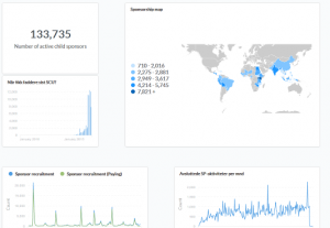
This was the pivotal step in the process – Now a whole team is on board with using the data warehouse, and have started building dashboards to watch the most important metrics. They’ve even found new useful metrics that can help understand our sponsors better! In other words, ease of use was a crucial element in attracting the users’ attention. Getting them interested and invested in the data is as important as building the entire technical stack in the first place.

Later on, if given the green light, I may share technical details and some of our findings here.

News Analytics Part I

News websites have always been horrible, but lately it feels like they’re somehow getting even worse. What do I mean? Well, for one, the pages are bloated. Megabytes of javascript and images are loaded just to read a couple of paragraphs of text. The front pages are usually very loud and cluttered, and the headlines are often clickbaity rather than explanatory. Finally, the stories don’t usually give any context to the issue they discuss, but rather simply assume you’ve read their other articles earlier (especially when there are big stories in the news, the information is often spread into myriad different stories that don’t have any apparent chronology).

I wanted to get around these issues, so I started drafting a system to organize and present the information the way I wanted it.

I started out with a couple of initial premises:

  • I wanted to be able to read the news based  on the stories and how they develop rather than reading a single isolated article. This meant I had to find a way to identify what articles/headlines are discussing the same story.
  • The pages must be minimalistic – no (or few) pictures, fast loading, as little javascript as possible.
  • Multidimensional: I want to be able to explore the news through multiple dimensions. This includes source (site), category (e.g. financial news, sports) and keywords.
  • Sentiment scoring: I’d come across software that could perform sentiment analysis on a text, then return a score. I had ambitions to integrate this to give a view of e.g. the sentiment development over time per keyword and/or source. Unfortunately I did not find the time to do this part during the first iteration.

I had a simple idea I started out with – Any developing story ought to be identifiable through a combination of three of the keywords (a triad) in the headline, and the context (earlier stories) would share one or two keywords. In other words, a story would probably show up in multiple papers with different titles, but with at least three similar elements. I figured the most popular combinations would most likely bubble up to the top naturally, giving me a solid list of which (combinations of) headline keywords were trending.

Here’s an outline of how I built my system:

I started out by building a web crawler. To keep it simple I stuck to using RSS feeds as the data source, then put together a side system to fetch and parse the articles themselves. I put great care into the data structure, as it would grow very fast once I started running the crawler regularly. I came up with a novel idea for the keyword triads; I made a table with three columns to store these. I would sort the keywords alphabetically, then build every possible combination of keyword in a sorted manner – that way I would avoid duplicate combinations in different order.

Now I needed a front-end – not as exciting to describe, I simply put together a table-like structure which would show headlines and source, with a spot for the sentiment value and a link to the article on its website.

After setting the system up and running some early tests, I realized that my initial assumption was wrong. I was unable to group the same story from different sources because the headlines differed more than expected. I got clickbait like “will make you” dominating the top of the list, which obviously do not identify one and the same story. After filtering out the news sources teeming with clickbait, I found  that most “real” news are covered different enough between agencies that the headlines can be completely different. Every combination of words from one common story dominated the results at one time (when agencies actually did post the same headline), and all in all there was more garbage than value. This put an abrupt stop to this iteration of the project, and sent me back to the drawing board.

This was still a learning experience, and gave me the necessary insight to start building the second iteration.

Turns out there’s a trend where the shittiest titles tend to be the most prominent – If I’d read this article before starting, I would probably never have finished the first iteration:
Study of most commonly shared headlines

Identifying batches of consecutive dates in SQL

Disclaimer: This is a solution done in T-SQL aka Microsoft SQL. It may be possible to recreate in other database systems, but I haven’t explored that option yet.

This is a solution to a very specific problem I’ve encountered, which might prove useful to others. A while ago I started looking into the code of our solution for overdue payments (in regards to subcriptions, e.g. the customers are billed monthly but not always paying), which appeared to have some issues. I found an oddly constructed procedure where I couldn’t for the life of me understand why it would’ve been built that way. My first instinct was to try to build it from scratch and see what the major showstopper would be.

The biggest hurdle was identifying each specific cluster of undisrupted payments, as that’s not quite straightforward when looking at the data.

To take you through this process, let’s start off by defining the table we’re working with. I’ll exclude fields that aren’t relevant, keeping this explanation as simple as possible.

SubscriptionID (bigint – Identifier for the subscription whose payment is overdue)AmountDue (float/money)
AmountPaid (float/money)
DueDate (date)

This should be enough to get us going.
Now, on to the previously mentioned hurdle; How do we split the data into groups for each series of completed (or missing) payments?

Our first query gives a list of all the missing payments. This is where we start.

SELECT
i.SubscriptionID,
i.DueDate
FROM Invoices i
WHERE i.AmountPaid = 0 /* let's only look at the completely unpaid ones for now */
AND i.DueDate < GETDATE()

Now comes the clever part – a trick I came across somewhere on Stack Overflow. We want to group each series of recurring payments into its own group, and figure out how long the break lasted and how much was due. There isn’t any obvious variable to group this data by, but we can create one! We know the time series will be increasing by 1 month for each row, and so any deviation from that formula should mean a break in the pattern (and thus a new series).

You may be familiar with the MSSQL function ROW_NUMBER(), which can enumerate rows based on your given criteria. This will give a steadily rising number for the rows we’re already looking at. It won’t care whether there was a break in the dates or not, so we need something more. By calculating the number of months (for a monthly recurring payment – if the intervals are different then this method would need to be adjusted for that) that have passed since a given point in time, we’ll be closing in on our goal.

ROW_NUMBER() OVER( ORDER BY i.SubscriptionID, i.DueDate ) AS rn,
DATEDIFF(month, '1900-01-01' , i.DueDate) AS mnth

These two combined will give us what we need. The number of months minus row number will give the same result for each recurring record, giving us a variable we can start grouping them by!

SELECT
ROW_NUMBER() OVER( PARTITION BY SubscriptionID, Batch  ORDER BY DueDate) AS IntervalsMissed,
DueDate, SubscriptionID,
ROW_NUMBER() OVER (PARTITION BY SubscriptionID ORDER BY InvoiceStartDate DESC) AS rn -- the row with rn=1 would be the most recent

FROM (
SELECT
i.SubscriptionID,
i.DueDate,
DATEDIFF(month, '1900-01-01' , i.DueDate)- ROW_NUMBER() OVER( ORDER BY i.SubscriptionID, i.DueDate ) AS Batch
FROM Invoices i
WHERE i.AmountPaid = 0
AND i.DueDate < GETDATE()
) a

Here we go, the resulting data set gives us a list of every cluster of missed payments our customers have, complete with how many recurring months they missed their payments for each of them. In our case we use this to identify those who are currently in a miss-streak, and ignore the historical data. There’s quite the number of things one can do with such data, but that’s a topic for another day.

Until next time!